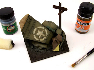
Moving right along this morning I started with some sponge 'chipping' using Model Flex Weathered Black and once it was dry went over it all with one light pass of AK Interactive filter to darken the star a bit and tie the whole surface together. The filter bottle says 'NATO tanks' but as with all products, these labels are guides to where they are best used but it doesn't mean you can apply them elsewhere. Olive drab is very similar to the green in NATO camouflage and this filter works very well for my taste.
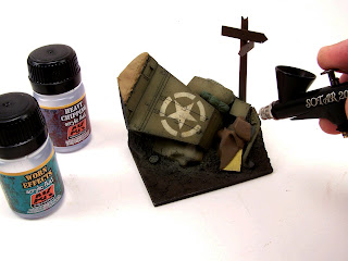
Then I used some of AK's new chipping effects, poured straight into the airbrush and misted on in two coats, the second after the first had dried completely. This seemed to behave quite nicely in the airbrush and sprayed rather smooth and trouble free. Much easier than decanting the wife's hairspray after sneaking it out of the bathroom cupboard.
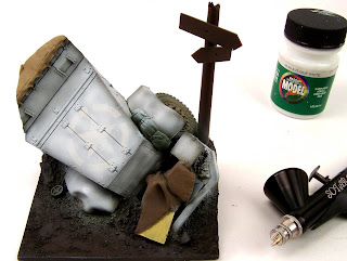
I followed this up with a random coat of Model Flex Antique White, I sprayed it heavier into the nooks and crannies where it would receive the least amount of wear and made sure to remain random in the larger areas. I tried to let some of the surface color below bleed through over the whole model, heavier in some areas, less in others. This will help to gauge the thickness of paint and where it will chip off easier than other spots when I begin chipping.
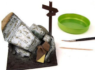
Using ordinary tap water, I began slowly picking my way around the vehicle with a small brush and a toothpick. Just as I had planned, the paint came off easiest where it was thinnest, and required more work where it was heaviest.
Next up, Mapping.
This is one of many techniques that somewhere along the line, was given a fancy name by a modeler and has been bounced around from time to time. What does it mean exactly, and why is it called mapping is anyone's guess I suppose but names notwithstanding, this is another technique that has it's merit and when combined together with other subtle effects, produce finishes that are more richer and interesting to the eye IMO.
Mapping seems to get just as much negative press as any other 'modern' painting/finishing technique and I'm not sure why. Is it simply because we don't like change? We don't understand it, or have difficulty applying it ourselves that causes us to simply dismiss it with a wave of the hand a la "these aren't the droids you are looking for"?
When considering a winter white wash in WWII we might want to consider it's properties, it's application method and it's lifespan. Whitewash was usually a low grade finish applied in the field under not the greatest of conditions, that was easily worn of and/or washed off by the rain/weather etc. The result could be several layers of applied, worn off and re-applied mixtures, all varying in tone and shade and all having different levels of dirt and wear. Some layers might be bright white, while other layers may be dingy gray.
While the chipping method alone does look great, it is merely one shade and one layer. What if this vehicle had been white washed before some rain, then redone after a new snowfall and then saw action, wouldn't there be some variation in the shades of white due to this action?
Anyway, enough talk, on to some photos.
I mix up a few different shades of white oil paints with some other colors to 'dirty' them up a bit and then, I do the same with some acrylic paint. I go back and forth between the two mediums with a fine brush, using the acrylics fast drying time as well as the slowness of the oils to my advantage to created different effects
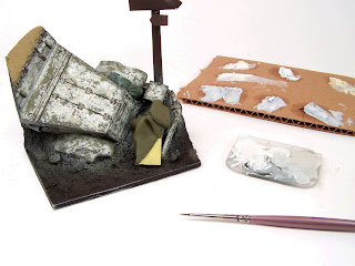
The effects should be very subtle, almost invisible at a quick glance. It's when layers of all these subtle changes come together in the end that makes the difference. I have posted a photo of three separate photos assembled side by side so the subtle shift of tones and layers becomes apparent and easier to notice. This subtle change doesn't always strike the viewer as a very important step and perhaps that is why it is so easily disregarded, in the end however it plays an important role in my whole layering process.
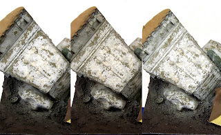
Even in the above collage, the effect is very light and subtle but that's what I'm shooting for. I don't want stark contrasts in color, just slight variations that isn't achievable with just one coat of white. Once the scene is finished it may even fade even further into the background and barely catch the viewers attention but it is none the less, an important step of the process for me which gives the model in the end, a depth not possible without it.
what a wonderul job Ken !!! . you succeeded in what is most difficult to achieve: to give each piece a distinctive tone and yet blend everything in an overview that seems totally natural.
ReplyDeleteThank you Hubert, I appreciate your comments.
ReplyDeleteKen
Looks beautiful. I have tried the hairspray a couple of times to see how it works but I can't seem to get it to work. Maybe I don't use enough hairspray or too little varnish.
ReplyDeleteThanks K~
ReplyDeleteIt does have a lot to do with the paint you use on top of the HS as well. My first try was Vallejo paint, it sucked, came up in sheets. I've read Tamiya paint is the best bet this Badger paint worked a treat.